The biggest blind spots in organizations come from disconnected views on strategy, KPIs, OKRs, projects and tasks. While your team manages work in project tools and task trackers, management looks at KPIs, and execs talk about strategies. Tasks can't easily be traced to the needles they're supposed to be moving, so teams keep investing time on work that doesn't align to the strategy anymore. That misalignment has a name: execution risk, the gap between a goal and the effort, resources and focus actually pointed at it. The two sides are also wildly different sizes. A strategy is a few hundred words. The execution beneath it produces millions of data points a week, and almost none of it reaches the people deciding what to fund. This white paper examines why the gap exists and what it costs before turning to how it closes. It is also, read another way, a specification: everything below is what strategy execution software has to do before it is worth installing. Strategy execution software is the system that holds your goals in any framework and keeps them connected to the work delivering them, so progress is read from real delivery instead of retyped from a status round. Most products sold under that label stop at holding the goals. For the sourced research on how large the gap is across organizations, see our strategy execution statistics.
Last reviewed October 2026.
The Fragmented Reality of Modern Organizations
Every organization above a handful of people runs into the same structural problem: strategy lives in one place, goals live in another, and the actual day-to-day work lives in yet another. The CEO defines a strategic direction in a slide deck or planning document. The leadership team translates that into quarterly OKRs or annual goals, usually in a spreadsheet or a dedicated goal-tracking tool. And the people doing the work - engineers, designers, marketers, salespeople - manage their tasks in Jira, Asana, Linear, Monday, Notion, or one of dozens of other project management tools.
None of these systems talk to each other in any meaningful way. The strategic plan doesn't automatically update when a key result moves. The OKR dashboard doesn't know which Jira tickets are contributing to which objective. And the person closing tickets every day has no easy way to see whether their work is still connected to a goal that still matters.
This is a category gap. Strategy tools are designed for executives. Goal-tracking tools are designed for managers. Task-management tools are designed for individual contributors. Each tool optimizes for its audience, and none of them are designed to maintain the connective tissue between layers.
Thin Data on One Side, Rich Data on the Other
Underneath the fragmentation sits a second asymmetry, and it explains most of what follows. The two sides of an organization are not only disconnected. They are wildly different sizes.
On one side sit the strategy, the goals, and the narrative that holds them together. A company might spend a year and a seven-figure consulting fee arriving at it. What comes out the other end is still a few hundred words: a handful of goals, each one a twenty-word sentence with a KPI attached. That is the entire strategy layer.
On the other side sits the execution layer, the effort actually spent pursuing that strategy, and it generates millions of data points a week. Tasks opened and closed. Comments, blockers, reassignments. The Slack thread where someone got pulled onto a different project halfway through a sprint. The project whose last real activity was three weeks ago and nobody has noticed yet. The remark made in the final thirty seconds of a meeting that turned out to be the most consequential thing said in the room.
Thin data on one side, rich data on the other. And the decisions that matter most, where to add people and what to stop funding, get made on the thin side, because the thin side is the only one leadership can see. That is rarely a preference. Nothing carries the rich side upward in a form anyone can act on, so the thin side wins by default, every quarter, in every planning cycle.
The thin side is the strategy layer: the goals, the KPIs, and the narrative connecting them. Small enough to read in ten minutes.
The rich side is the execution layer: every task, comment, thread, and quiet decision produced by the people doing the work. Large enough that nobody reads it at all.
Running an organization means holding the two together. Almost every tool built so far handles them separately.
The Inherited Assumptions Nobody Re-examines
Disconnected tools are the obvious diagnosis. Underneath it, the goals themselves often rest on constraints that stopped being true years ago.
A market entry decision from 2022 shapes which segments get investment in 2026. A pricing model chosen before the current product existed determines how teams prioritize feature work. A headcount cap set during a downturn persists as an unquestioned constraint long after the budget recovered. These are not active decisions. They are decision debt: assumptions embedded in yesterday's decisions that silently shape today's execution, often long after the original context changed. We borrow the term from Imran Afzal's original framing of decision debt on The Strategic PMO, which describes it as the accumulated cost of institutionalized decisions whose assumptions no longer match reality. When leaders set goals on top of these inherited constraints without re-examining them, the goals themselves become misaligned. Teams execute faithfully against targets that were built on a foundation nobody has tested. The effort is real. The alignment is an illusion, because it was never a property of the work, only of the plan.
This is why intentional goal setting matters more than goal tracking. Before an organization can align effort to outcomes, it has to ask which constraints are real and which are inherited. Which initiatives deserve more investment, which deserve less, and which should stop entirely. OKR management alone does not answer these questions. It only makes the answers visible after someone does the harder work of choosing.
The Two Visibility Problems
Organizations that recognize the gap typically invest in one of two kinds of visibility.
Goal visibility means making the strategy itself legible: the strategy-making process, the KPIs chosen to track it, the initiatives planned to move them, and the OKRs cascaded down from the company level to every team, so each group can see how its quarter connects to the ambition above it. You run the offsite, choose the KPIs, and publish the result where everyone can find it. Every one of those steps is real work, and it shows. The theory: if people can see the goals, they will align their work. The practice: seeing the goals does not tell you whether the work underway actually supports them. You can stare at a KPI dashboard all day and still not know which of your 47 active projects is the one moving the number. Goal visibility is visibility on paper. A goal published without a link to the effort beneath it documents an ambition and stops there. Every hour spent here goes into making the thin side more legible, and the thin side was never the part nobody could read.
Project visibility means making initiatives, timelines, and status updates accessible - and there is an entire industry built to do exactly that. PMO functions exist to track it. Project and task apps exist to make it visible. Daily scrums, weekly syncs, and status meetings exist to say it out loud. A meaningful share of every manager's week goes into this: tracking where resources are spent, where team focus actually sits, what is being worked through in a Slack thread or a comment on a task, and what got decided in a meeting that never made it into any tool at all. None of that effort is wasted, exactly. But none of it is connected, either. Each system tracks its own slice of the work, and every one of them is built to do the same thing with what it collects: aggregate it, abstract it, and hand a leader a percentage, a status label, or a risk flag. The theory: if leaders can see what teams are working on, misalignment will surface. The practice: you can see work descriptions, but you cannot see the effort, focus, and energy spent. A project that is on time and on budget looks healthy in every status report. Whether it still connects to a goal that still matters - that is invisible. The initiative slide deck the board reviews is not the same as where the time actually goes.
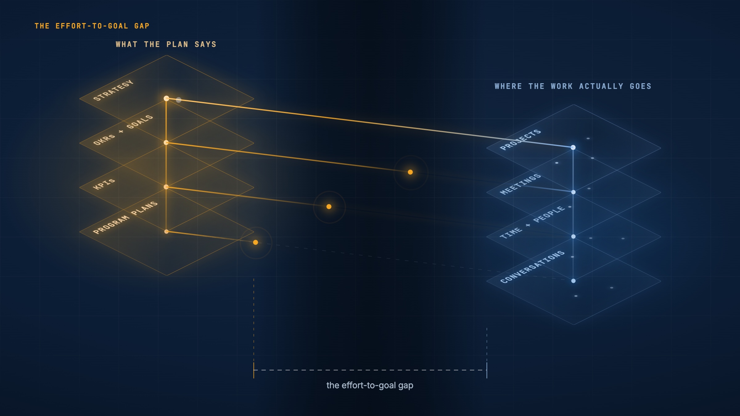
The knowledge that would close the gap doesn't live in any one place. It is scattered across a dozen disconnected systems that were never built to talk to each other. And where it does get captured, it gets abstracted away on the way up: a comment thread becomes a status update, a status update becomes a percentage, a percentage becomes a color on a slide. Aggregation destroys the raw material of analysis. The signal was never sitting in one comment. It was in the pattern across all of them. By the time it reaches a leader, what they're looking at is a compression artifact, not the source.
Vindaris is intelligent strategy execution software built to hold both halves in one graph. It maps your strategy, goals, and KPIs down to every project and task, which gives the thin side a structure. Two-way integrations with Jira, Asana, HubSpot, MS Planner, and Excel bring in the rich side, along with conversation transcripts, Slack and Teams threads, and email.
The concept is simple but important: connect effort to goal. Real effort, where the time is actually spent, not the sanitized version that surfaces in monthly reviews. And real goals, ones that have been intentionally set against current constraints, not goals inherited from a planning cycle that assumed a different world. When you compare real effort against intentionally set goals, you can see whether the organization is effectively coordinating action - or just coordinating plans.
The effort-to-goal gap is the distance between where a goal says an organization should be spending its time, and where the organization is actually spending it. Neither goal visibility nor project visibility measures this distance. Both assume the connection exists. Neither checks.
The Effort-to-Goal Gap Is the Real Problem
Goal visibility and project visibility are both attempts to see one half of a relationship. Neither one, on its own, tells you whether the two halves still match. The gap between them - what a goal calls for and what effort is actually pointed at it - is where organizations lose the most ground, and it is the layer most tools never measure directly.
Ask most leadership teams where their people's time actually goes this quarter, and the honest answer is: nobody knows, not precisely. The scale of the noise is measurable: knowledge workers spend about 60% of the day on "work about work" - status updates, chasing information, and coordination rather than the skilled work itself - per Asana's survey of more than 10,000 workers, summarized in our strategy execution statistics. What gets reported is the board-slide version - the initiative list, the roadmap review, the version that has already been cleaned up and summarized for a room with forty-five minutes on the agenda. It is not a lie. It is also not where the hours went. The real allocation - who is actually touching what, how long a task sat before anyone circled back to it, how many people are quietly parked on a project that stopped being urgent months ago - lives in a hundred small places nobody aggregates: task assignments, comment threads, calendars, Slack channels. That list is the rich side. The answer to the question exists, in more detail than anyone could want, in a form nobody can read. Until that real picture is visible, a leader cannot answer the question that actually matters: is this the best use of the resources, effort, and focus this team has? Not whether the work is happening. Whether it's the right work, done by the right number of people, against a goal that still matters.
Misallocation shows up in a handful of recognizable shapes. A team keeps a project running that should have been cancelled outright when the strategy shifted. A project that should continue gets worked the wrong way - the wrong sequence, the wrong scope, built for a market segment the company no longer prioritizes. A project sits at the wrong priority level, treated as urgent when it is peripheral, or treated as background noise when it is actually load-bearing for a KPI leadership is watching closely. Or a project has the wrong number of people on it: three engineers grinding on something that should be a single person's part-time effort, or a single overloaded owner carrying something that should have a full team behind it. Each of these is a mismatch between resources and the goals those resources are meant to serve. Each is invisible to a percent-complete field.
Closing this gap is not a side project. It is most of what management already spends its time doing, whether it names it that way or not. Every strategy offsite is an attempt to articulate the priorities. Every OKR planning cycle is an attempt to break those priorities down into goals a team can act on. Every meeting, every dashboard review, every quarterly business review is an attempt, usually manual and usually incomplete, to check whether the resources allocated match the priorities articulated - and to move people, budget, and attention when they don't. Articulate the priority, break it down into goals, allocate the effort, then check the allocation against the priority again. That loop, run continuously, is what running an organization actually is.
Most of that loop runs on percent-complete fields. A project is "60% done." A key result is "on track." Both are compressions. What compression removes is what a leader needs to close the effort-to-goal gap. A percentage cannot tell you that the 60% complete work is the wrong 60%. It cannot tell you that "on track" only holds if a dependency ships on a date everyone privately suspects will slip. It cannot carry the comment thread where an engineer flagged that the approach wouldn't scale, or the Slack exchange where a manager quietly deprioritized a project without updating its status, or the meeting where three people agreed to change scope and nobody wrote it down anywhere the OKR tool could see.
That context is not a footnote to the work. It is usually where the real signal lives. A status field says a project is healthy. The comments underneath it, the thread where the blocker got discussed, the log of who actually touched the task and when, often say something different - and say it days or weeks before the percentage catches up. The rich side knows first. It always knows first. The distance between when it knows and when the number catches up is the window a leader could have acted in.
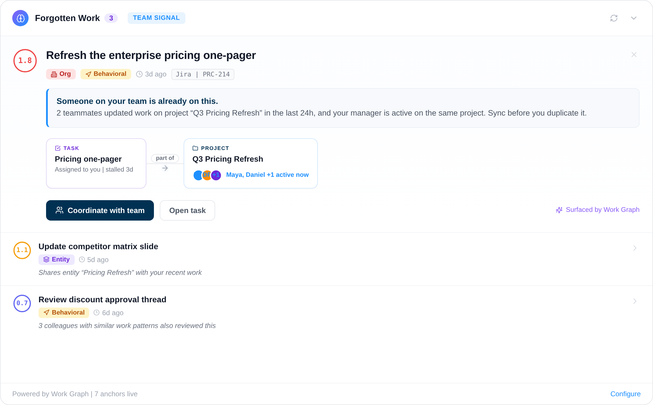
This is the specific gap Vindaris was built to close, and it is why the Work Graph does not stop at syncing status fields between tools. It reads the full context around each piece of work - the comments, the linked conversations in Slack and Teams, the update logs, the people actively touching a task - and carries that context up through the project it belongs to, the goal it supports, and the KPI it's meant to move. Two teams can both report "60% done" and mean entirely different things by it. A system built on percentages cannot tell them apart. A system built on the full thread behind the work usually can.
The Cost of Execution Risk
The consequences of this disconnect are well-documented but rarely quantified at the organizational level. Research from the Project Management Institute consistently shows that organizations waste about 11.4 cents of every dollar invested in projects, roughly 12% of total investment, through poor performance. A significant share of that waste comes from executing the wrong things rather than executing badly. Teams finish projects on time and under budget, only to discover that the strategic rationale behind the project evaporated months ago.
Consider the lifecycle of a typical initiative. In Q1, leadership identifies a strategic priority: "Expand into the mid-market segment." This becomes an OKR with measurable key results - a revenue target, a number of new accounts, a product-readiness milestone. Product and engineering teams spin up projects, break them into epics and stories, and start shipping. So far, so good.
By Q2, the competitive landscape shifts. A major competitor launches a compelling enterprise offering, and leadership pivots: the mid-market expansion is de-prioritized in favor of defending the enterprise base. The OKR is quietly archived or its targets are adjusted. But the projects are already in flight. The engineering team has three sprints of mid-market features on the roadmap. The marketing team has a mid-market campaign in production. Nobody sends an explicit "stop working on this" signal, because in the day-to-day flow of work, the connection between the task and the strategy it was supposed to serve has already been severed. The thin side updated the moment leadership changed its mind. The rich side never heard about it and kept running at full pace. Execution risk in its purest form: effort still flowing, at full pace, toward a goal the company has already left behind.
This is the default operating mode for most organizations. And it compounds: every team that continues working on a de-prioritized initiative is a team that isn't working on the new priority. The cost is both the wasted effort and the opportunity cost of delayed response to the strategic shift.
Why Dashboards Don't Catch Execution Risk
The instinctive response to this problem is "better reporting." Build a dashboard. Aggregate data from multiple tools. Give leadership a single pane of glass. This approach has been tried extensively, and it fails for a fundamental reason: dashboards are read-only snapshots of state, not living connections between layers of work. A percentage on a status page is the same abstraction problem described above, just with a chart around it. It can tell you a number moved. It cannot tell you why, or who already knew, or what they said about it two weeks before the number caught up. A dashboard is the thin side rendered in color. It is assembled from rich-side data that it throws away on the way in, which is why a better dashboard cannot fix this.
A dashboard can tell you that a KPI is trending down. It cannot tell you which specific tasks, across which teams, are supposed to be driving that KPI up. It cannot tell you whether those tasks are still in progress, blocked, or quietly deprioritized. And it certainly cannot tell you whether the people doing the work are aware that the KPI they're supposed to be influencing is now critical. Execution risk hides upstream of the number, in where effort and attention actually go.
There is a deeper problem, too. Even when everyone has access to the same dashboard, they assign different meaning to the same data. One team reads "KPI on track" as permission to maintain course. Another reads it as an invitation to reallocate. A third never looks at it. This interpretation gap means that visibility alone does not produce coordinated action. Ten people can look at the same number and walk away with ten different plans.
The missing piece is traceability, not visibility. Organizations need the ability to trace a line from any task, in any tool, up through the project it belongs to, the goal it supports, the KPI it's supposed to move, and the strategic theme it ultimately serves. And that trace needs to be live, bidirectional, and maintained automatically - because the moment it depends on manual updates, it decays.
The Work Graph: A New Connective Layer
The solution is a connective layer that sits across the entire stack, and it is the part every strategy execution platform on the market leaves out. We call this the Work Graph: a live, structured map of how every piece of work in your organization connects to the outcomes it's supposed to produce. Structurally, it is the edge layer between the two sides, the set of connections that lets the rich side be read through the thin side instead of in place of it.
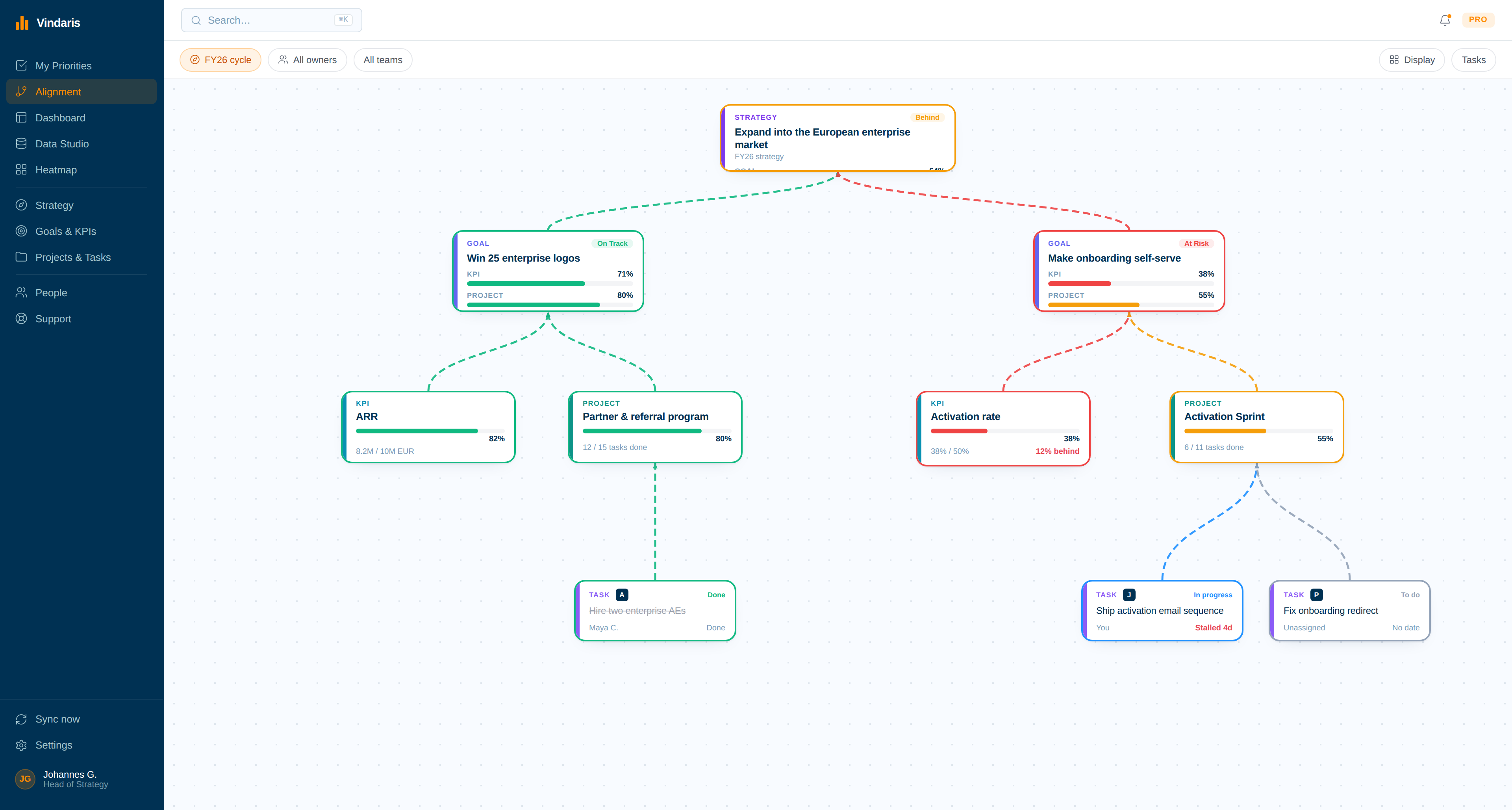
In a Work Graph, tasks are not flat items in a list. They are nodes in a directed graph that connects them upward to projects, goals, KPIs, and strategic themes. When an engineer closes a ticket in Jira, the Work Graph can trace the impact of that completion up through the goal hierarchy. When an executive adjusts a strategic priority, the Work Graph can trace the impact of that change down to every affected task, in every tool, across every team.
This is fundamentally different from integration in the traditional sense. Traditional integrations move data between tools - syncing a task's status from Jira to a dashboard, for instance. The Work Graph doesn't just move data; it maintains relationships. It knows that ticket ENG-1234 contributes to the "Reduce onboarding time" objective, which supports the "Improve net revenue retention" KPI, which is a pillar of the "Defend enterprise base" strategy. And it maintains that chain of relationships in real time, even as tasks are created, completed, reassigned, or reprioritized in their native tools.
Five Capabilities That Change How Organizations Operate
When the Work Graph is in place, five capabilities emerge that are impossible in a fragmented environment. Together they turn the effort-to-goal gap from a quarterly surprise into a daily, observable signal:
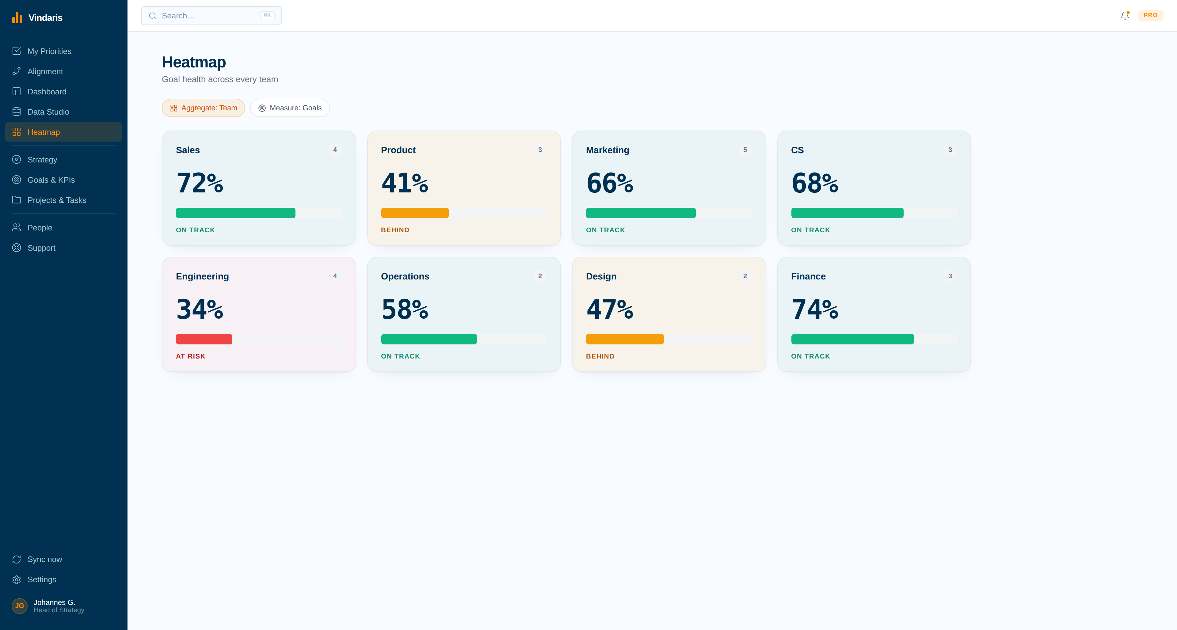
Strategic Alignment Scoring. Every team's active work can be scored against the current strategic priorities in real time, the way the heatmap below scores eight functions against their goals. If 40% of an engineering team's capacity is invested in projects that no longer connect to an active strategic theme, that surfaces immediately - not in the quarterly review, but as it happens. Leaders can course-correct in days, not months. An alignment score is the rich side measured against the thin side, which is why neither an OKR tool nor a task tracker can produce one on its own.
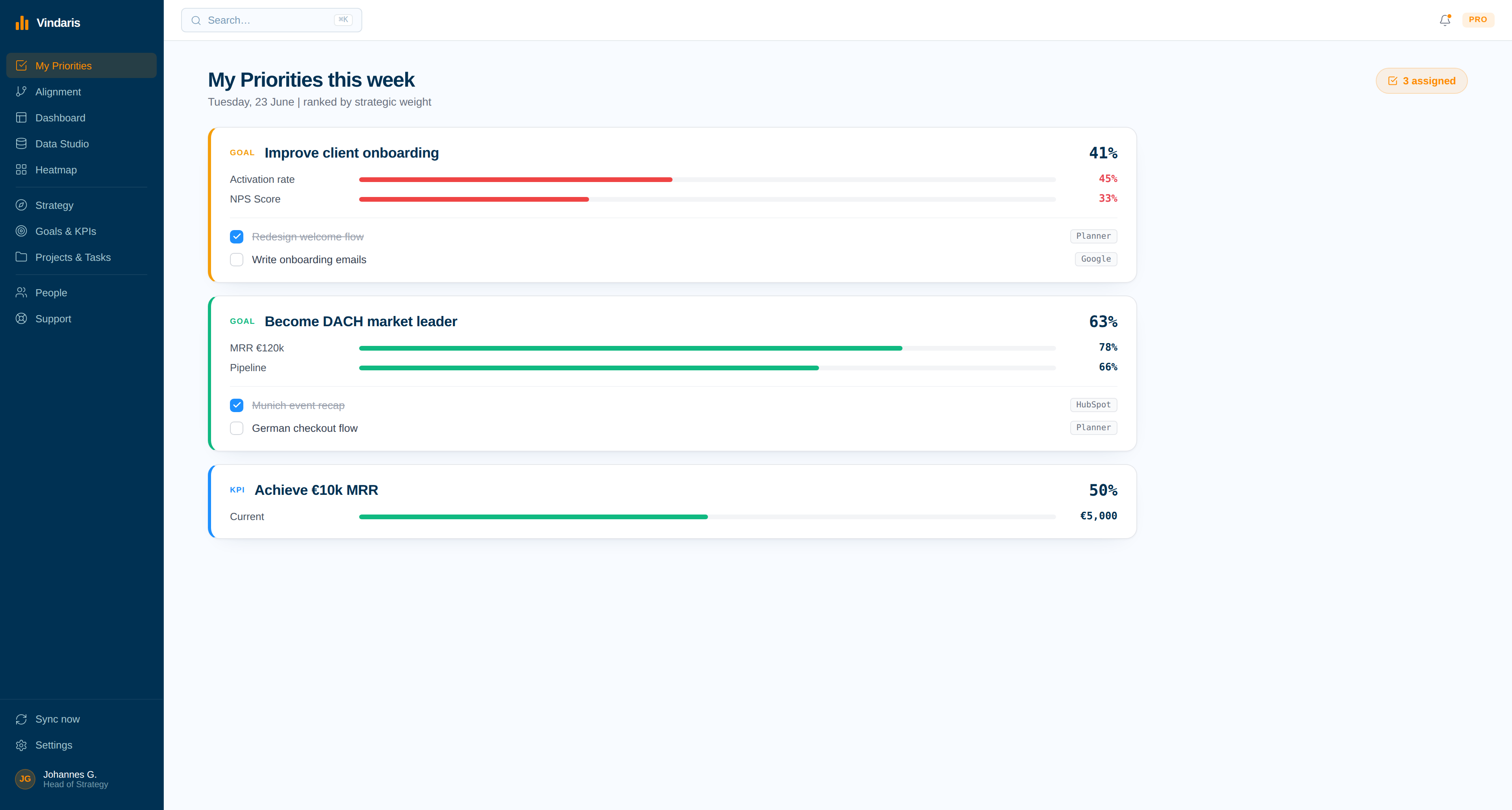
Priorities Ranked by Strategic Weight. Instead of a flat task list sorted by due date, every person's queue is ordered by how much a task actually moves a connected goal. When leadership shifts a priority, the ranking updates underneath every affected person automatically - the cascade that used to travel through a chain of meetings and Slack messages now reaches the work itself the same day the decision is made.
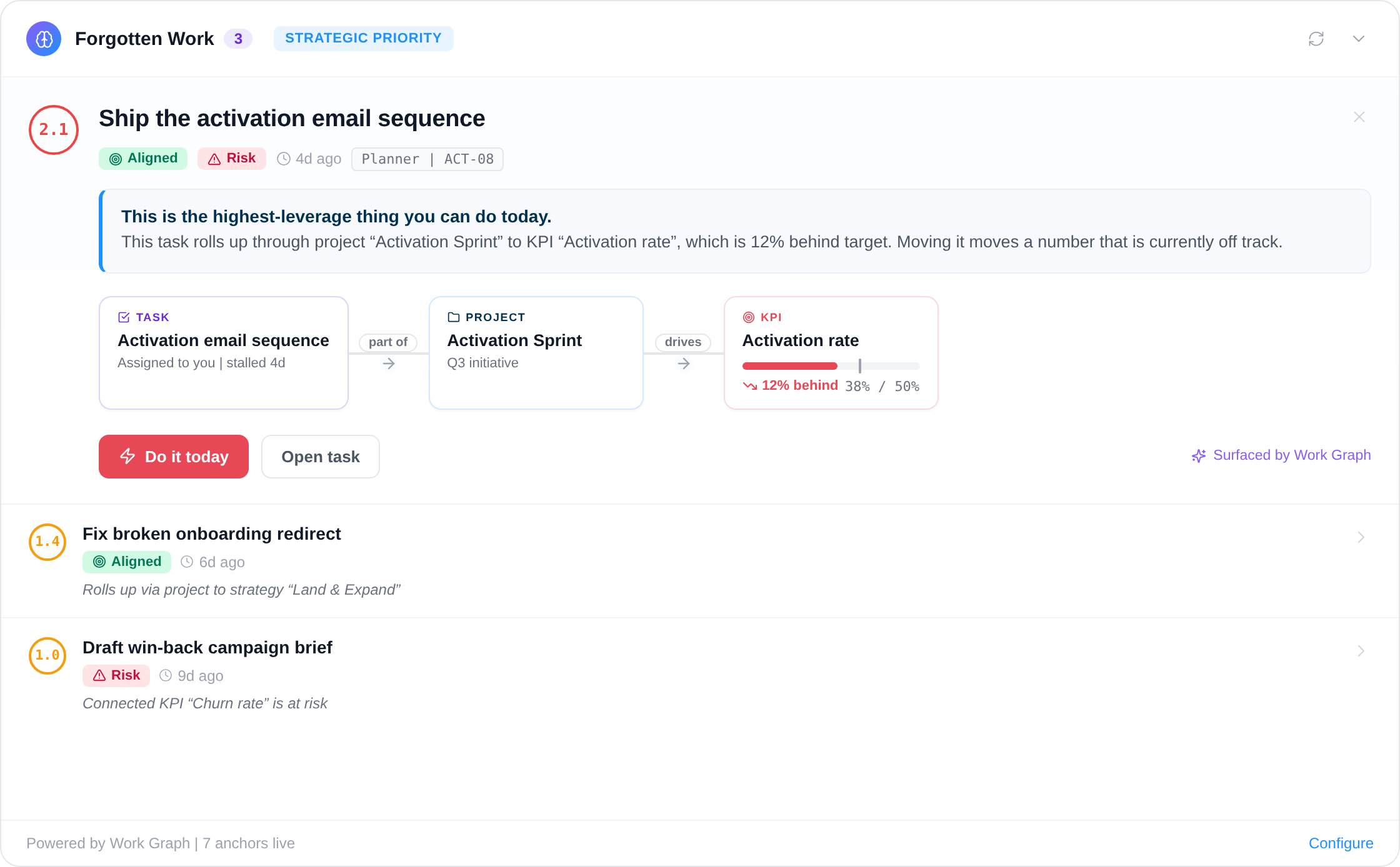
Forgotten Work Detection. One of the most insidious forms of waste is work that continues after its strategic rationale has expired, or work that quietly stalls on something that still matters. The Work Graph surfaces both: tasks and projects that are active but disconnected from any live goal, and tasks that are connected to something urgent but have gone stale. These often look perfectly healthy in isolation. They have assignees, due dates, and regular updates. They just don't matter anymore, or they matter more than anyone realizes.
Full Task Context, Not Just a Percentage. This is the capability that separates a Work Graph from a sync job. Every node in the graph carries the conversation around it: the comments on the task, the linked Slack or Teams thread, the update history, who else is actively working nearby. When two teammates are heads-down on the same project without knowing it, the graph says so before the duplicate work happens, not after. A status field can say "in progress." Only the full context says what that actually means today. This is the one capability that delivers the rich side upward intact, at the altitude where funding and headcount get decided.
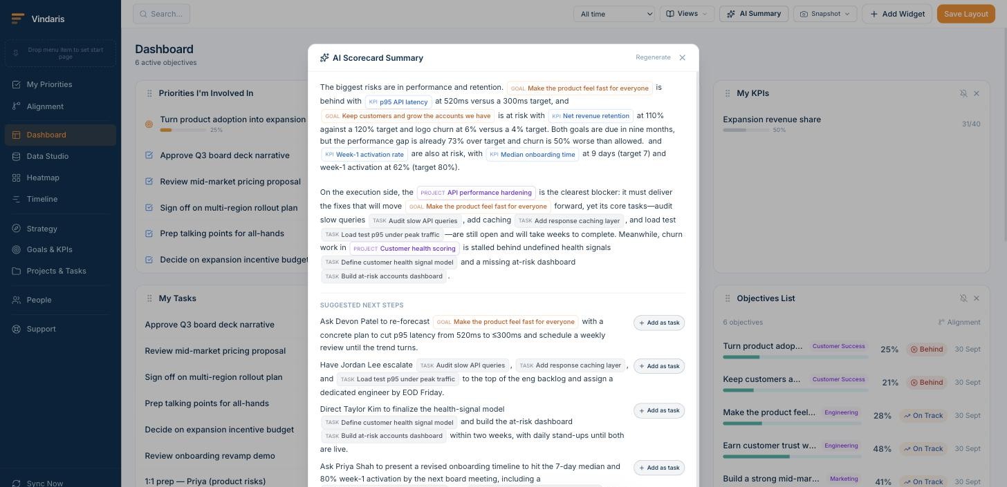
AI-Synthesized Impact Narratives. Raw traceability is only useful if someone can act on it fast. The Work Graph can turn its own structure into a written brief: which goals are most at risk, which blockers are actually load-bearing, and who should be asked to do what by when, with the option to turn any of it directly into an assigned task. This replaces the guesswork of preparing a quarterly business review with a synthesis that already knows which of a team's efforts are moving the needles that matter, and which are producing output without impact.
How rufmacher found a five-figure gap between its pipeline and its priority
rufmacher runs a sales-driven go-to-market motion and used to spend hours a week assembling pipeline reports by hand before Vindaris automated that reporting into Data Studio. The alignment scoring underneath that same sync later turned up a second finding, separate from the qualification-step insight covered in the full case study: about a fifth of one region's active pipeline work was still tagged to SMB accounts, a segment leadership had deprioritized the previous quarter in favor of a DACH mid-market push. Nobody had told the reps to stop. The thin side had moved the previous quarter. The rich side, the task board the reps actually worked from every morning, had not. Those deals still showed as open, active, moving - the definition of an effort-to-goal gap, real hours pointed at a goal the company had already stopped chasing.
“The reports told us the pipeline was healthy. The Work Graph told us a fifth of it was healthy in the wrong direction.”Sales operations, rufmacher
Reassigning that pipeline time closed most of the gap within the following review cycle, and the same alignment score now flags it automatically if it opens again.
Read the full rufmacher case study →The Work Graph as a Digital Twin of Strategy Execution
The term "digital twin" entered manufacturing decades ago: a continuously updated virtual replica of a physical system, detailed enough that changes to one can be tested in the other. A jet engine has a digital twin that mirrors its thermal loads in real time. A factory floor has one that simulates throughput before a new line is installed. The principle is the same in every case. Build a model that stays faithful to the real system, and you can see failure coming before it arrives.
Strategy execution has never had one. The closest equivalents are dashboards, which are snapshots, or OKR tools, which hold the goal layer but not the work. Neither is a model. A model maintains state: every entity, every relationship, every change, continuously reconciled against reality. A dashboard presents a reading. That gap is where every "what happens next" question dies unanswered.
The Work Graph, once populated and syncing, functions as exactly this: a digital twin of strategy execution. It holds the full structure of how an organization converts intent into action. The strategic priorities, the goals beneath them, the KPIs chosen to measure progress, the initiatives carrying the weight, the projects within those initiatives, and the tasks individuals are actually touching today. But it holds more than the structured hierarchy. It holds the rich context around each piece of work: the Slack and Teams threads where scope got negotiated, the meeting transcripts where a priority quietly shifted, the task comments where an engineer flagged a blocker nobody escalated, the email chain where a handoff fell through. Every edge in that graph is a claim: this work serves this goal. Every sync cycle tests the claim against what is actually happening in the connected tools and the conversations around them.
A digital twin of strategy execution is a continuously synchronized model of the full path from strategic intent to individual effort. It mirrors every layer of the organization's execution structure, maintains the edges between them, and updates as the work itself changes - drawing on task data, conversation threads, meeting signals, and collaboration context so the model is always as current as the last action someone took.
What makes a digital twin different from a goal tracker with integrations is the fidelity of the replica. A goal tracker holds goals and rolls up a number. A digital twin of strategy execution holds goals, KPIs, initiatives, projects, tasks, the comments on those tasks, the Slack threads linked to those projects, the meeting transcripts that changed the direction, the owners, and the temporal pattern of activity across all of it. It can answer not only "is this goal on track" but "which of the eight projects under this goal had a human being actively working on it in the past five business days, and which went quiet." The twin's value is proportional to the richness of the model. Thin twins produce thin answers.
The manufacturing analogy breaks in one important way. A jet engine's digital twin mirrors a physical process whose physics are well understood. A strategy's twin mirrors a human process whose dynamics change every time someone makes a decision that never gets written down. The twin has to be robust to missing data, inconsistent naming, late updates, and the reality that not every consequential action happens inside a tool. This is the reason the Work Graph ingests conversation context from Slack and Teams threads, email activity, meeting transcripts, and calendar signals alongside structured task data. The most consequential moment in a strategy's quarter might be a remark in the final thirty seconds of a leadership meeting. If the twin does not ingest the transcript, that moment is invisible.
An organization that builds and maintains a digital twin of its strategy execution gains something that has not existed before in strategy work: the ability to run its entire execution state through a single queryable structure. Not a report assembled from five sources. Not a slide someone built on Thursday. The live state, continuously, with the full graph of relationships intact.
Process Mining the Strategy Layer
Process mining, in its original sense, reconstructs how work actually flows through a system by reading event logs. It was built for operational processes: order-to-cash, procurement, patient discharge. The logs are structured, the steps are repeatable, and the question is usually "where does the process deviate from the designed path."
Applied to strategy execution, the question is different and harder. There is no designed path. A strategy does not prescribe a sequence the way a purchase order does. It sets a direction and a set of outcomes, and the work that delivers those outcomes takes a different route every quarter, in every team, for every goal. The "process" being mined is not a workflow. It is the pattern of how effort flows toward outcomes, or fails to.
The digital twin makes this kind of mining possible for the first time. Because it holds every edge between strategy and work - and because those edges carry temporal data from task updates, conversation threads, and meeting context - the model contains the event log that process mining needs. Not a log of steps in a business process, but a log of where organizational effort concentrated, where it shifted, where it stalled, and where it leaked away from the goals it was supposed to serve.
Three patterns show up consistently when you mine this layer:
Effort clustering. Work does not distribute evenly across goals. In most organizations, a small number of goals attract a disproportionate share of active tasks while others are technically active but have no recent human activity behind them. The imbalance is often invisible to leadership because status reports treat every goal equally. Mining the activity layer reveals the actual distribution, and the goals that are starving quietly.
Effort leakage. Tasks get reassigned. Projects absorb scope. People get pulled onto something urgent and never come back. Over weeks, the effort that was originally pointed at a strategic goal drifts sideways into work that serves a different priority or no priority at all. The original goal still shows its tasks as assigned. Activity has simply stopped. Leakage is the most common form of execution risk, and it is the one that conventional project tracking is least equipped to detect because the task looks normal in every individual view. Only the pattern across the full graph makes it visible.
Effort cycling. Some goals generate activity without producing progress. Teams open tasks, close them, open new ones, reassign them. The activity log looks healthy. The outcome does not move. Cycling usually signals a structural problem: the goal is defined in a way that cannot be delivered by the work planned under it, or the work is addressing a symptom rather than the cause. A static alignment score can miss cycling because the edges are intact and the tasks are active. Mining the temporal pattern reveals it.
Traditional process mining asks: does this process follow the designed path? Strategy process mining asks: does this effort reach the intended outcome? The first has a blueprint to compare against. The second has a goal and a graph, and the graph is the closest thing to a blueprint strategy execution has ever had.
This is where the Work Graph moves beyond a reporting tool and becomes an analytical instrument. The five capabilities described above tell a leader what the current state is. Mining the patterns underneath tells them why the state is what it is, and whether the same forces are likely to produce the same result next quarter.
From Retrospective Score to Forward Signal
Every measurement system described so far in this paper, alignment scores, forgotten work alerts, strategic weight rankings, produces a reading of the present or the recent past. That is already more than most organizations have. But the digital twin, once it has enough history, can go further: it can flag where execution risk is forming before the score reflects it.
The mechanism is not prediction in the machine-learning sense. It is pattern recognition across the graph's temporal layer. If a goal lost active contributors three weeks before it went red in each of the last four quarters, and the same pattern is forming now, the signal is structural, not statistical. The twin does not need a training set. It needs the same graph it already maintains, read across time instead of at a single point.
Three forward signals the twin can surface once it holds enough history:
Stall precursors. A project whose update frequency drops below its own baseline - not a global threshold, but the pace that project specifically maintained when it was healthy - is more likely to miss its next milestone than one whose pace holds steady. The twin can flag the deceleration the week it begins, not the week the milestone slips.
Contributor withdrawal. When the number of distinct people actively touching a goal's downstream work drops, the goal is at risk regardless of what the remaining contributor reports. A goal that had five people working under it last month and two this month has not become more efficient. It has lost attention. The score may not move for weeks. The contributor count moved already.
Scope-to-capacity divergence. A goal whose task count is growing while its contributor count is flat is absorbing scope without absorbing capacity. This is the pattern behind every "we took on too much" retrospective, and it is visible in the graph weeks before the retrospective happens.
None of these signals require a forecast model. They require a graph that remembers its own prior states and a set of comparisons that any analyst would run manually if the data were in front of them. The twin makes the data available. The comparisons run continuously.
The shift from retrospective score to forward signal is the difference between a system that tells you what happened and a system that tells you what is about to happen. Both are useful. The second one gives you the window to act.
But building a twin this rich on top of point-to-point integrations is brittle. Every new tool in the stack adds another connector to maintain, and every schema change in a connected tool can quietly break an edge the twin depends on. The next section examines why the connective layer itself needs to be a system of record, not a patchwork of syncs.
Why This Requires a System of Record
Building a Work Graph on top of point-to-point integrations is brittle and ultimately unsustainable. Every new tool in the stack requires new integration logic. Every schema change in a connected tool can break the graph. And the semantic meaning of relationships - "this task contributes to this goal" - cannot be reliably inferred from integration data alone.
This is the line that separates strategy execution software from a goal tracker with an integrations page. What's needed is a system of record for strategy execution: a single authoritative source that defines the hierarchy from strategy to goals to KPIs to projects to tasks, and maintains bidirectional sync with every tool where work actually happens. The system of record holds the thin side and every connection running out of it. The connected tools hold the rich side. Neither replaces the other.
This is the approach Vindaris takes, and it is why we describe the product as strategy execution software rather than goal management. The category name matters less than the test behind it: can the system name the tasks behind a number, or only the number? Rather than asking organizations to move their work into yet another tool, Vindaris maintains the Work Graph as a connective layer above the existing tool stack. Teams keep working in Jira, Linear, Asana, or whatever tool they prefer. Vindaris syncs bidirectionally with those tools, enriching each task with its strategic context and propagating changes in both directions.
The conviction behind the product came from running 300 strategy execution transformations for organizations across the world over seven years. The shape of the work was remarkably consistent. It never started with a workshop. It started with analysis: understanding the actual strategy, the real constraints, and where the current goals had drifted from both, before a single OKR got drafted, because a room full of executives arguing over first principles wastes the one day they have together. Then came the executive session itself, an intensive push to convert vague ambitions into outcome-based goals. The hardest facilitation moment was almost always the same one: catching a team mid-sentence as they wrote down a project plan and called it a Key Result. "Launch the new pricing page" is an output. "Increase trial-to-paid conversion by four points" is an outcome, and most teams need someone in the room to make them feel the difference before they can write it themselves without help. From there, the goals cascaded: department and team-level workshops translated executive intent into goals each function could actually own, instead of a mandate handed down from above that nobody felt responsible for.
The last phase was supposed to be the easy part - embedding the check-ins and the operating rhythm that keeps goals alive between planning cycles, so the alignment in the room didn't evaporate the moment everyone went back to their desks. That is where it broke, every single time. The workshops worked. Teams left aligned, with clear goals and real energy behind them. Then, within weeks, the mechanics broke. Not because the framework was wrong, but because nobody could make the gap between work done and strategic intent visible - and act on that visibility. The rituals meant to keep the goals alive had nothing to run on except memory and good intentions, and both decay fast once the room empties. The Work Graph is the layer those transformations were missing.
The result is that every person in the organization - from the CEO reviewing strategic progress to the engineer picking up the next ticket - is looking at the same reality. Not the same tool, but the same underlying graph of how work connects to outcomes. When that graph is accurate, maintained automatically, and accessible to everyone, the strategy execution gap closes.
Getting Started: From Fragmented to Connected
Adopting a Work Graph doesn't require a big-bang transformation. The most effective approach is incremental: start with one strategic theme, connect the goals and KPIs that support it, link the projects and tasks that contribute to those goals, and let the value compound from there. In practice that means taking one piece of the thin side and wiring it to the rich side underneath it.
The first insight usually arrives within the first week. A project that everyone assumed was aligned to a current priority turns out to be connected to a goal that was deprioritized two quarters ago. A KPI that leadership watches closely turns out to have no active tasks driving it. A team that appears busy turns out to have most of its capacity invested in work that doesn't connect to any current strategic objective. Each of these is execution risk made visible, and each was invisible the week before.
These aren't failures of the people involved. They're failures of the information architecture. When the connections between strategy, goals, and work are maintained manually - through status meetings, spreadsheets, and slide decks - they inevitably decay. When they're maintained automatically, through a live Work Graph, they stay current. And when they stay current, organizations stop investing time on work that doesn't align to the strategy anymore.
That's what connected work means. Not a new place to manage tasks. A living map of how everything your organization does connects to everything your organization is trying to achieve.
Frequently asked questions
What is strategy execution? Strategy execution is the work of turning a plan into delivered outcomes: connecting each goal to the work that moves it, giving every goal a single owner, and keeping the link between effort and result visible as conditions change. It is not the planning and it is not the delivery. It is the layer between them, which is why it has historically had no system of its own.
Why does strategy execution fail? Because the goal and the work that delivers it live in separate tools, so the connection between them is maintained by hand and decays between reviews. A strategy is a few hundred words; the execution beneath it produces millions of data points a week. Nobody reconciles those two sides continuously, so a dashboard can read green while the work behind it has stalled. The failure is architectural rather than a matter of discipline.
What is strategy execution software? Software that holds your goals in any framework and connects them to the actual work in the tools your teams already use, so progress is derived from real delivery instead of manual updates. The test that separates it from a goal tracker is whether the system can name the specific tasks behind a number, or only report the number. See the strategy execution management page for how that works in practice.
What do the strategy execution statistics actually show? The research is consistent across two decades: roughly 12% of total investment is lost to poor project performance, most employees cannot state their organization's strategy, and a large share of active work has no live goal attached. The strategy execution statistics roundup collects the sourced figures with their original studies.
How is a strategy execution platform different from a BI dashboard? A BI dashboard reports numbers that already exist and is only as current as its last refresh. A strategy execution platform holds the edges between strategy, goals, KPIs, projects and tasks, so it can answer why a number moved and which work is behind it. Dashboards describe the thin side. The platform connects the thin side to the rich side.
Do I need strategy execution software if we already run OKRs? OKR tools store and report objectives; they do not carry a work layer, so the progress number is still typed in by the owner. If your OKR reviews open with a round of self-reported confidence ratings, the tool is holding the goals but not the execution. The best strategy execution software roundup compares the category on exactly that line.