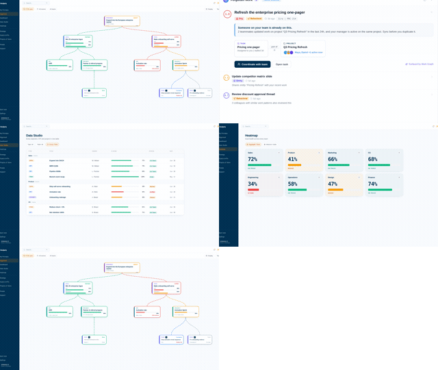
KPI dashboard examples that show more than the current number.
A dashboard earns its screen space when it warns you before a number misses, and most only report where the number is today. The examples below come from a live Vindaris workspace. Each shows a different way to put the target, the pace and the work behind the KPI on one screen, with notes on what to copy.
All of them click through to the individual task, and the Slack thread around it, behind any number on screen.





What should a KPI dashboard include?
Four things per KPI: the current value, the target, the pace toward that target, and a path to the work behind the number. Most dashboards stop after the first two. That is the root of the green dashboard problem: every widget looks acceptable right up until the number misses, because position was on screen and trajectory never was.
Value and target
The baseline pair every dashboard gets right. Show the number against what it is supposed to become and by when, with the owner named. A target without a deadline on screen invites everyone to assume there is more time than there is.
Pace, not just position
The piece most dashboards miss. A KPI at 60% of target is healthy in week four and unrecoverable in week ten; only the rate of progress against time remaining tells those apart. Pace is what turns a dashboard from a scoreboard into a warning system.
The work behind the number
When a KPI drifts, the next question is always why. A dashboard that links each number to the projects, tasks and conversations meant to move it answers that in a click instead of a meeting, which is what the examples below all have in common.
Trend and comparison
Week-over-week and quarter-over-quarter context stops the dashboard from lying by snapshot. A flat line and a recovering line can hold the same value today and mean opposite things; the trend is the difference.
 Click thru live demo
Pre-built workspace. No signup.
Click thru live demo
Pre-built workspace. No signup.
Every example on this page comes from this workspace. Click through it live, no signup.
Six KPI dashboard examples, from executive view to task level.
Each example answers a different question. Together they cover the range a company actually needs, from the board meeting to the Monday stand-up.
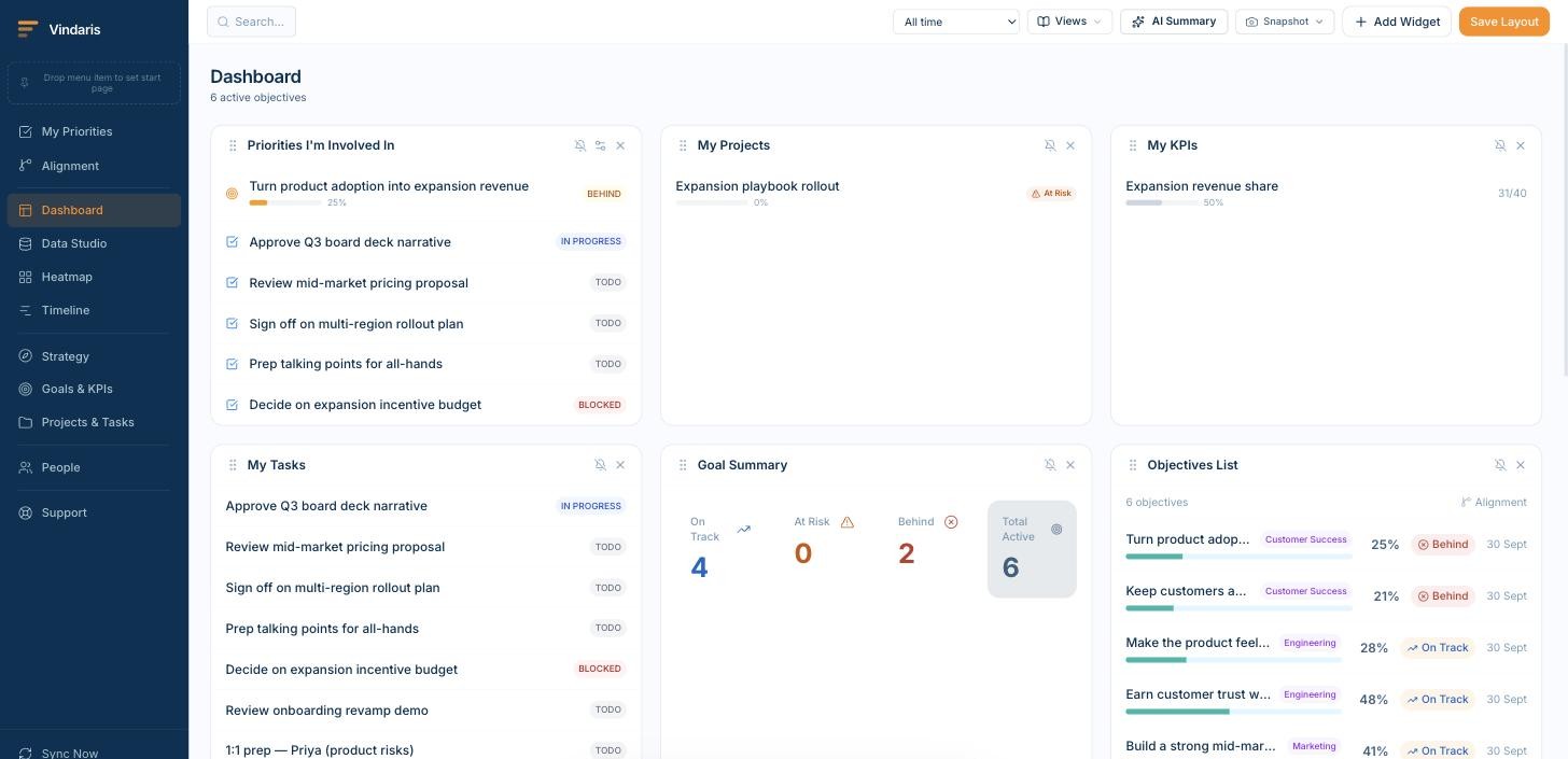
Executive KPI dashboard
The leadership view: the handful of committed numbers, each with value, target and pace, grouped by strategic theme rather than by department. Nothing on it requires explanation in the meeting, because the drill-down carries the explanation.
What to copy: ruthless selection. This example holds only KPIs that leadership has agreed to act on, which is what keeps the weekly reading under five minutes and the discussion on decisions.
Team KPI dashboard
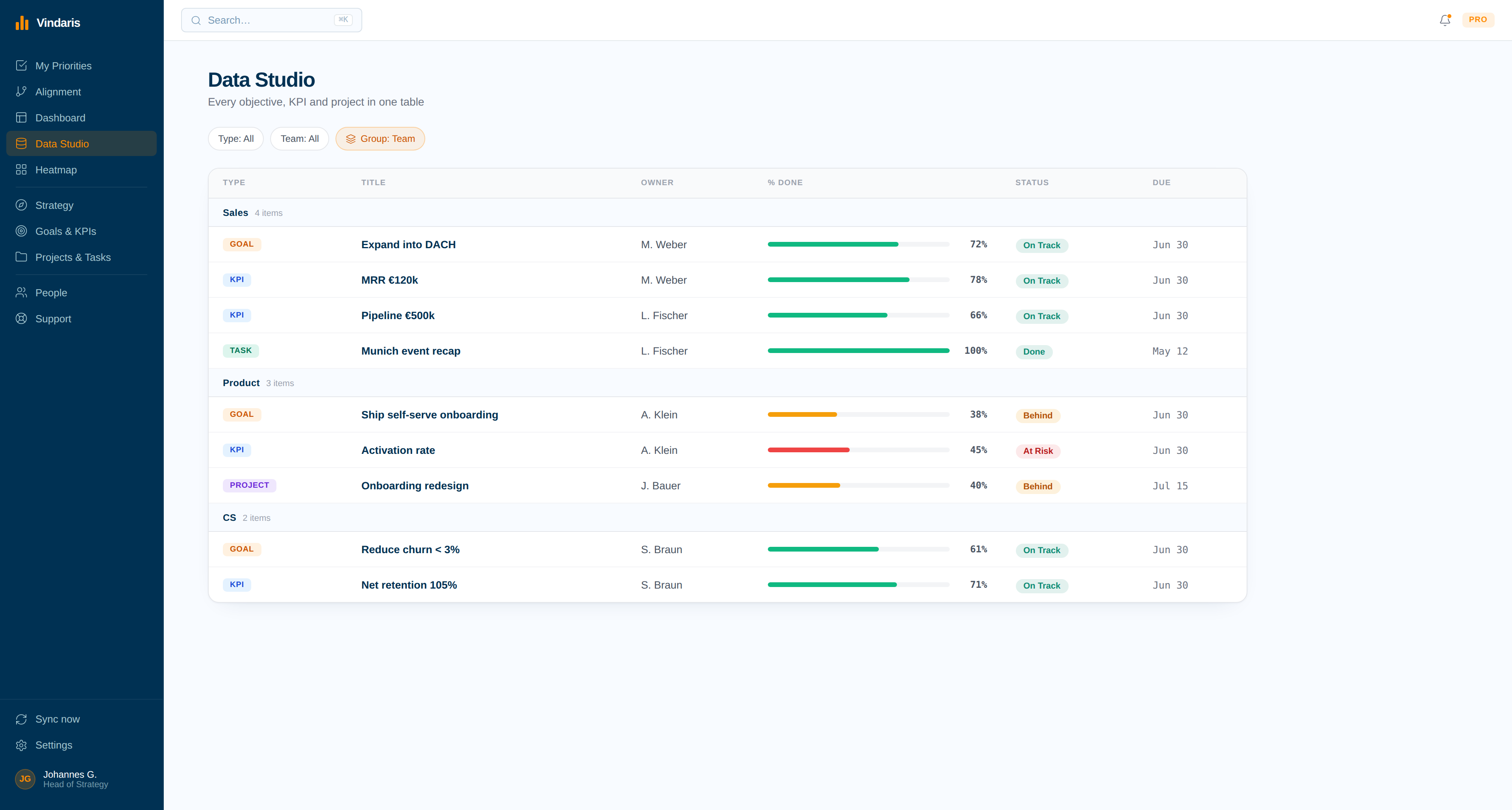
One team's numbers next to that team's live work. The KPIs the team owns sit above the projects and tasks currently moving them, so the dashboard doubles as the agenda for the weekly.
What to copy: the pairing. A team dashboard that shows KPIs without the work invites status theater; showing both makes the gap between effort and movement the first thing anyone sees.
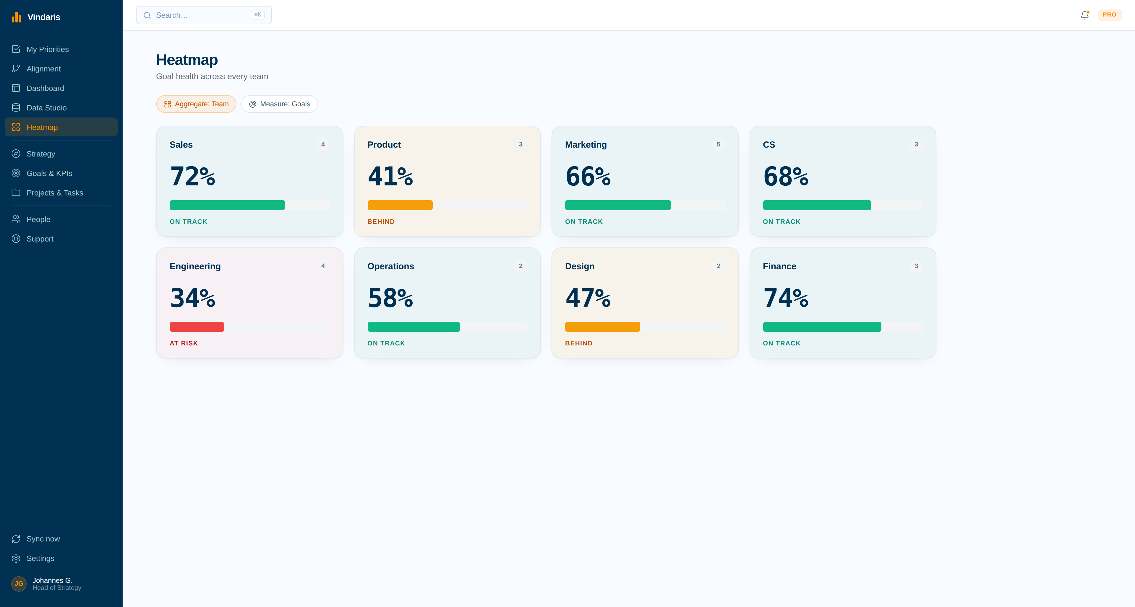
KPI scorecard with pace
Every team and KPI as a tile, shaded by pace against plan rather than by current value. A tile that just turned amber is a number that stopped being reachable this week, even if the value still looks fine.
What to copy: shading by pace. It moves the moment of attention from after the miss to weeks before it, which is the entire point of having a scorecard.
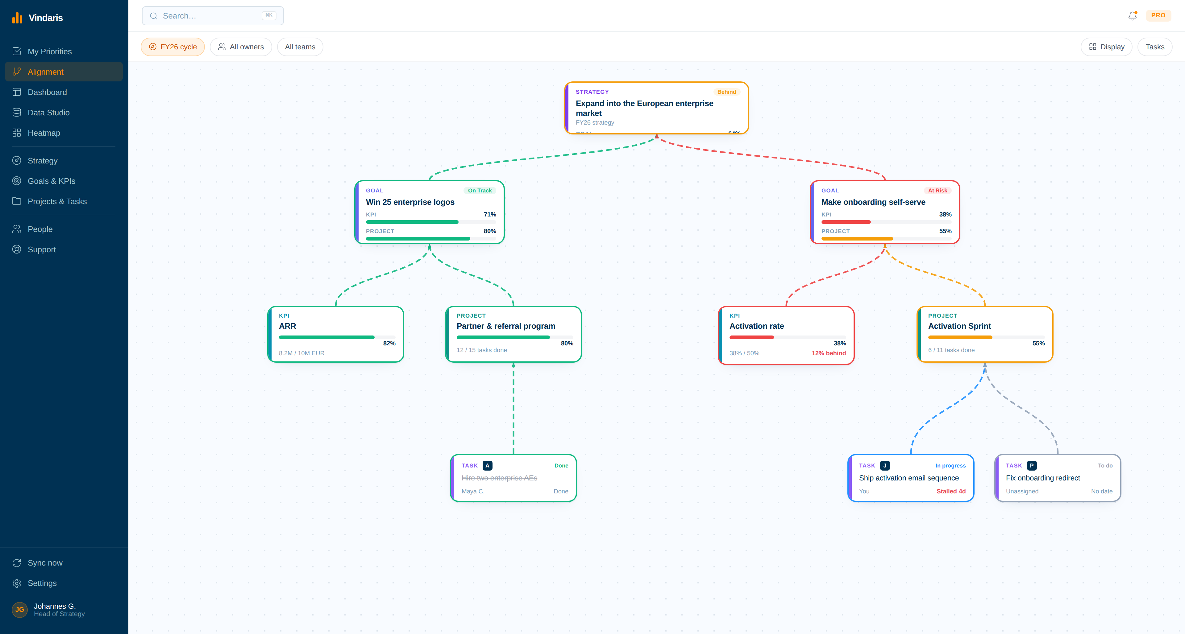
Alignment view over the work
The map view: strategy at the top, goals and KPIs beneath, projects and tasks at the bottom, with the connections drawn. KPIs with no active work beneath them are visible as gaps, before they become misses.
What to copy: treating the dashboard as a graph rather than a grid. The question this view answers, which numbers have nobody moving them, does not appear on any conventional KPI dashboard.
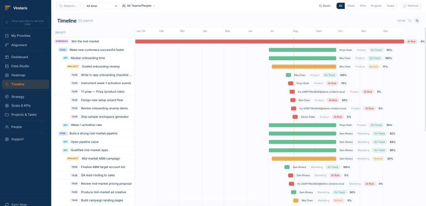
Trend and timeline view
KPIs over time with week-over-week and quarter-over-quarter comparison. The snapshot value is the least informative fact about a KPI; this view shows whether it is recovering, flat or decaying.
What to copy: put the comparison period on screen by default. A number labeled +4% vs last quarter needs no meeting to interpret.
AI status narrative
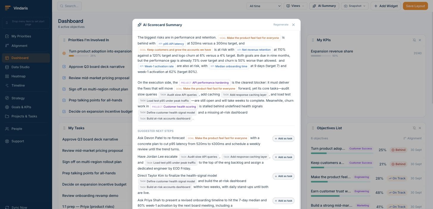
A scheduled narrative that reads the KPIs and the work behind them, then writes what moved, what stalled and why, delivered into Slack, Teams or email. The people who never open a dashboard still get the trend.
What to copy: narratives grounded in task-level data. A summary generated from the numbers alone restates the chart; one that reads the work underneath can name the stalled task behind the flat line.
Your framework, your language, your data in Europe.
Vindaris fits whichever goal syntax your teams already use, because the tracking problem is the same underneath and switching syntax should not mean switching tools.
Tracks goals in any framework
Vindaris ships without a prescribed methodology, so OKRs, KPIs, SMART goals and EOS Rocks are all tracked the same way in one workspace. Teams keep the format that suits them while leadership keeps a single connected view of progress.
Your data stays in Europe
Vindaris runs in a Hetzner data center in Nuremberg and was built around European data sovereignty from the start. Procurement and your DPO will find the answers they need in the trust center.
Free forever, including two integrations.
Free is a working tracker for a team of five, with two integrations and automatic progress. It is not a fourteen-day window, and there is no card to enter.
Best for individual contributors, small teams or startups. No credit card required.
- All views: Canvas, My Priorities, Heatmap, Data Studio and Task Board
- Two integrations of your choice
- Up to four additional members
- Five ad-hoc AI risk summaries per month
Best for teams, small agencies, or departmental and team management.
- Everything in Free
- All integrations, unlimited sync
- Unlimited AI risk summaries and alignment suggestions
- Up to ten users in one organization
Best for multiple teams, exec teams, Chiefs of Staff or full-org deployments.
- Everything in Connect
- Unlimited users in one organization
- Direct human support, 24h response
- Human-led onboarding
Try the pace idea on one KPI first.
Browser tools and real Office files that run without an account, if you want the core idea of these examples before connecting anything.
Common questions, answered
What should a KPI dashboard include?
Four things per KPI: the current value, the target, the pace toward that target, and a path to the work behind the number. Most dashboards stop after the first two, which is why they stay green until the quarter is already lost. Trend context and an owner per KPI complete the picture.
How many KPIs belong on one dashboard?
Fewer than most dashboards carry. An executive view works best with the handful of numbers leadership has actually committed to; a team view with the few KPIs that team owns. Past roughly a dozen widgets, the dashboard stops directing attention and starts absorbing it.
What is the green dashboard problem?
A dashboard can be accurate and still misleading: every widget shows an acceptable current value while the pace of the work underneath already guarantees a miss. Because dashboards report position rather than trajectory, the first visible warning is often the miss itself. Pace-aware views close that gap.
What is the difference between a KPI dashboard and a KPI report?
A dashboard is a live view someone has to open; a report is a snapshot that arrives on a schedule. In practice teams need both: the dashboard for working sessions, the scheduled report so the people who never open the tool still see the trend. In Vindaris the same view serves as either.
Can I build these dashboards on my own data?
Yes. Connect your tools, map KPIs to the work meant to move them, and each example on this page corresponds to a drag-and-drop view in Data Studio. The free plan includes every view type and two integrations, which is enough to rebuild most of these examples.
Build these dashboards on your own data.
Connect your first tool in 90 seconds. Every view here is in the free plan, or read how the commercial side works on KPI tracking software.
Build your KPI dashboard freeNo credit card | No migration | No minimum contract