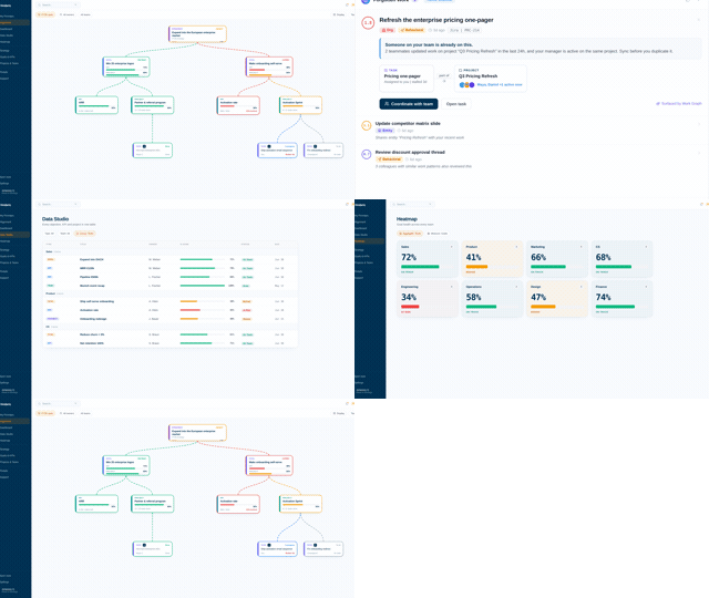
Executive dashboard examples that show the quarter before it is lost.
A dashboard that reports current values stays green right up to the miss. The five examples below show a different pattern: strategic KPIs with pace against plan, and every number traceable to the work producing it. Each one is a real Vindaris view a CEO, COO or Chief of Staff can copy.
Task-level context down to the Slack thread, so the executive view opens into the work instead of ending at a chart.





What should an executive dashboard show?
An executive dashboard answers one operating question: are we going to hit the goals, and if not, where do I act. That takes three layers on one screen. The strategic KPIs scored against plan. The pace of each, meaning whether the current trend reaches the target by its date. And the work behind any number that is off pace, so the next click is a diagnosis rather than a meeting request.
Executive dashboard vs BI dashboard
BI tools visualize warehouse data and answer analytical questions, and they are good at it. The executive view is an operating instrument: fewer numbers, each with an owner, a target and a pace, each connected to the work. The green dashboard that preceded a missed number was almost always a BI chart without pace.
Current value is the wrong headline
A KPI at 70% of target reads as progress. Whether it is on pace depends entirely on the date. Show pace as the primary state and the value as detail, and the dashboard starts predicting instead of recording. The examples below all make pace the color.
Every number needs a next click
The moment an executive sees red, the question becomes why. If the dashboard cannot open the projects, tasks and conversations behind the number, the why turns into a week of meetings. Traceability is the difference between a dashboard and an executive dashboard.
Fewer tiles than you think
Ten KPIs or fewer for the top view. Anything more spreads attention thinner than the operating cadence can act on. Function-level detail belongs one level down, on views owned by the COO, CFO or team leads, which is exactly how the examples below are layered.
 Click thru live demo
Pre-built workspace. No signup.
Click thru live demo
Pre-built workspace. No signup.
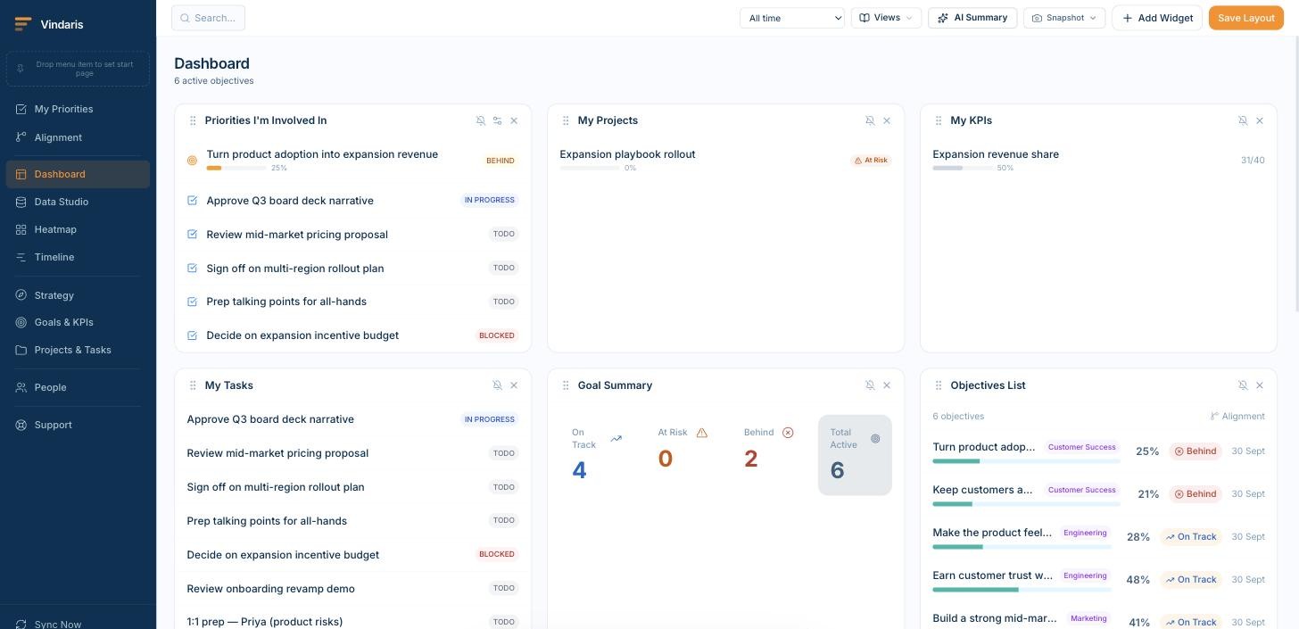
The example dashboards below are live in the demo workspace, with the KPIs, projects and synced tasks behind every number. Click through, no signup.
One data layer, a different view per chair.
The same connected goals and work, read differently depending on who is asking. These are the moments each view earns its place.
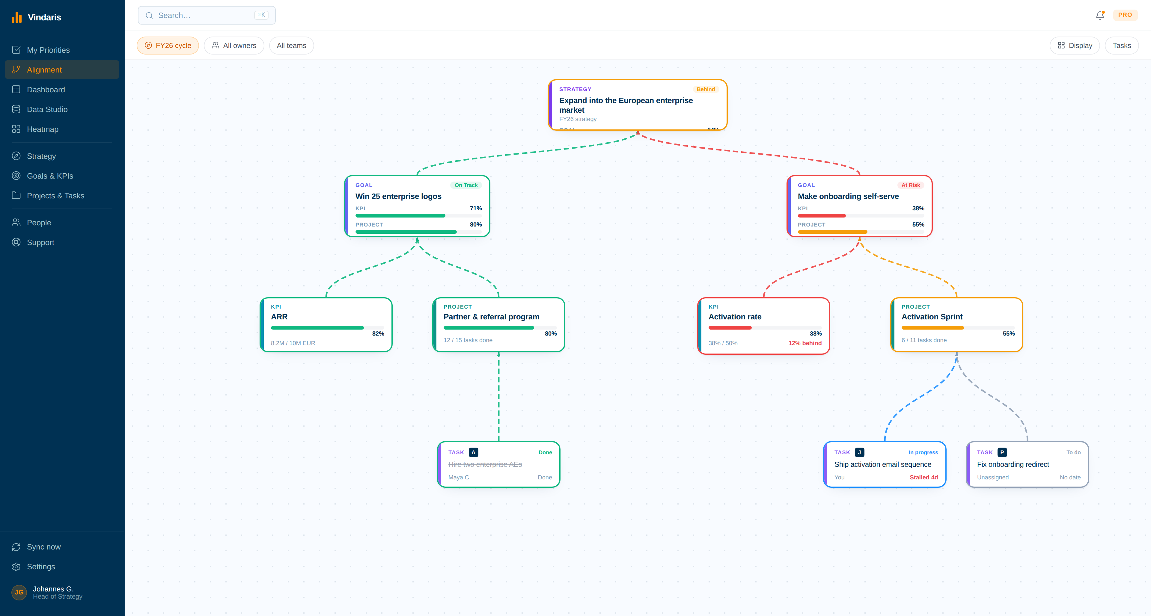
Five executive dashboard examples to copy.
Each example is a live Vindaris view. Copy the structure into your own workspace, or use it as the spec for whatever you build the dashboard in.
Pace is the headline
Every example colors by pace against plan, never by current value. A number can be high and still missing; pace is the state an executive can act on.
Each number opens
Every tile drills into the projects, tasks and conversations producing it. The dashboard ends at the work, never at a chart.
Nothing is assembled
All five views derive from connected tools. If a dashboard needs a weekly assembly ritual, it is a report with a delay, and the delay is where surprises grow.
Strategy KPIs with pace against plan
Eight tiles or fewer: growth against plan, the strategic-bet KPIs, cash, and one health signal per function. Pace coloring means the board question, will we hit the year, has a live answer.
- What to copy: KPI, owner, target date, pace state per tile.
- Week-over-week comparison on the same view, no export.
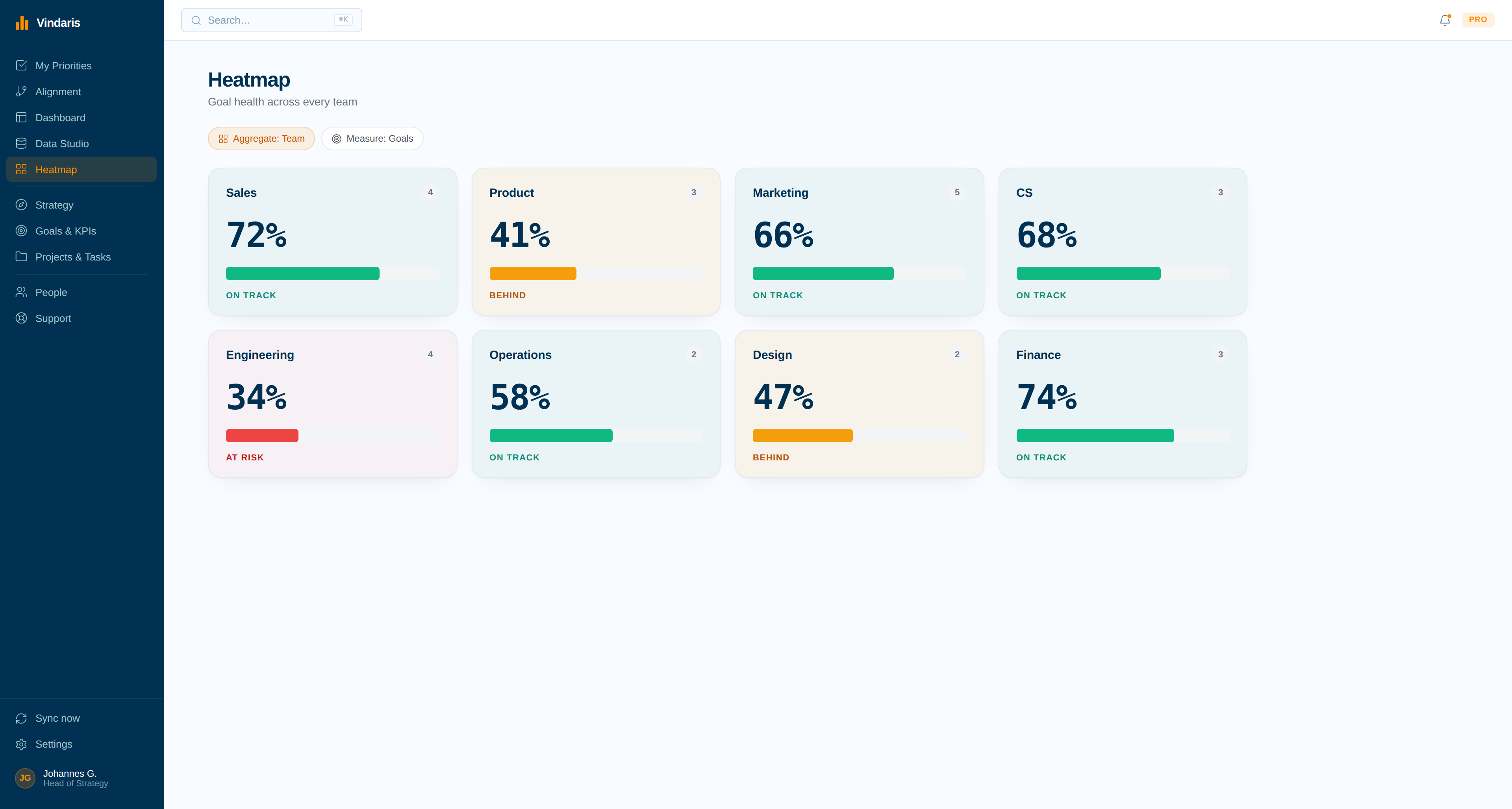
Cross-team execution as a heatmap
Every team and goal as a tile shaded by progress to plan. The COO scans for the block that changed, clicks through to the work that stopped moving, and skips the tour of five status meetings.
- What to copy: teams on one axis, goals on the other, pace as shade.
- Alert on color change, so scanning is optional.
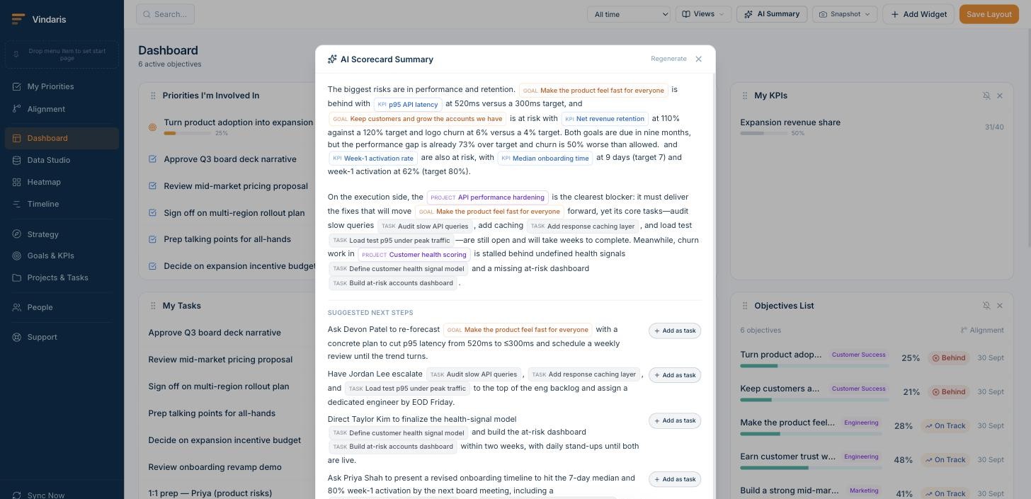
The pre-read that writes itself
An AI status summary drafted from live goal data, delivered to Slack or email on the review cadence. The Chief of Staff corrects instead of composes, and the leadership meeting reads the same page.
- What to copy: flagged items first, then decisions needed, then the trend.
- Scheduled per audience: exec team weekly, board monthly.
Initiatives mapped to the strategy
The canvas shows every initiative connected upward to a goal and a strategic theme, and the orphans that connect to nothing. This is the view that catches effort drifting away from strategy months before a KPI notices.
- What to copy: strategy, goals, KPIs, projects and tasks as one connected map.
- Orphaned work and unowned goals surface on the same screen.
The year's bets on one line
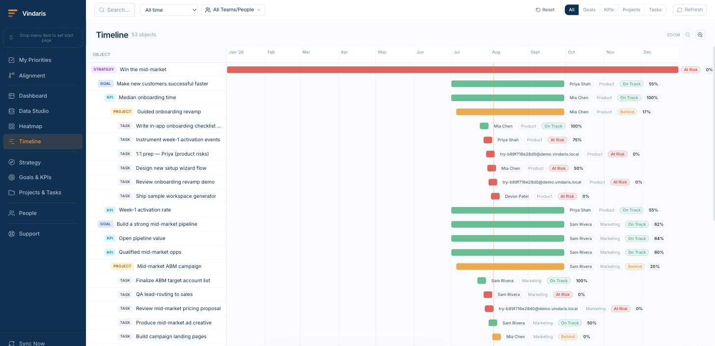
Strategic initiatives on a timeline with their goals attached, compared quarter over quarter. Board decks are cut from this view directly, which keeps the board version and the operating version the same numbers.
- What to copy: initiatives, owners, quarter markers, pace state.
- Quarter-over-quarter comparison without rebuilding the slide.
Why most executive dashboards fail quietly.
The failure mode is rarely the layout. It is a dashboard that reports current values, assembled by hand, disconnected from the work. It stays green while the quarter slips, and the post-mortem asks how nobody saw it. The essays behind these examples cover the pattern, and the KPI dashboard examples page covers the team-level views one layer down.
The green dashboard problem
A dashboard can be accurate and still useless for steering, because current value is a lagging summary. The green dashboard problem walks through why the color never changed before the miss, and what pace-based coloring fixes.
The board pack version of the same lie
When the operating dashboard and the board deck are assembled separately, they drift, and the board sees the friendlier version. The board pack lie covers cutting both from the same live view.
Role pages, with the views per chair
The CEO, Chief of Staff, Chief Strategy Officer, PMO and team lead pages show how each role runs its cadence on the same connected data, dashboard included.
KPI dashboards, one level down
The executive view summarizes; the function views carry the detail. The KPI dashboard examples gallery shows the team-level patterns, and the KPI tracking software page covers the data layer both run on.
Write the list once, never maintain it.
Type the goals you want tracked and who owns them, tag them with @, and the structure appears with the connected work already hanging underneath. Nothing about it needs updating afterwards.
The dashboard that taps you on the shoulder.
An executive dashboard nobody opens is a poster. These alerts push the state changes that matter to the owner's inbox, so the dashboard works even on the weeks nobody looks at it.
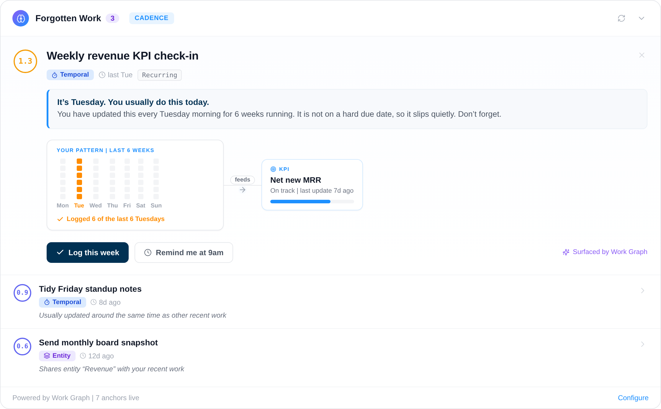
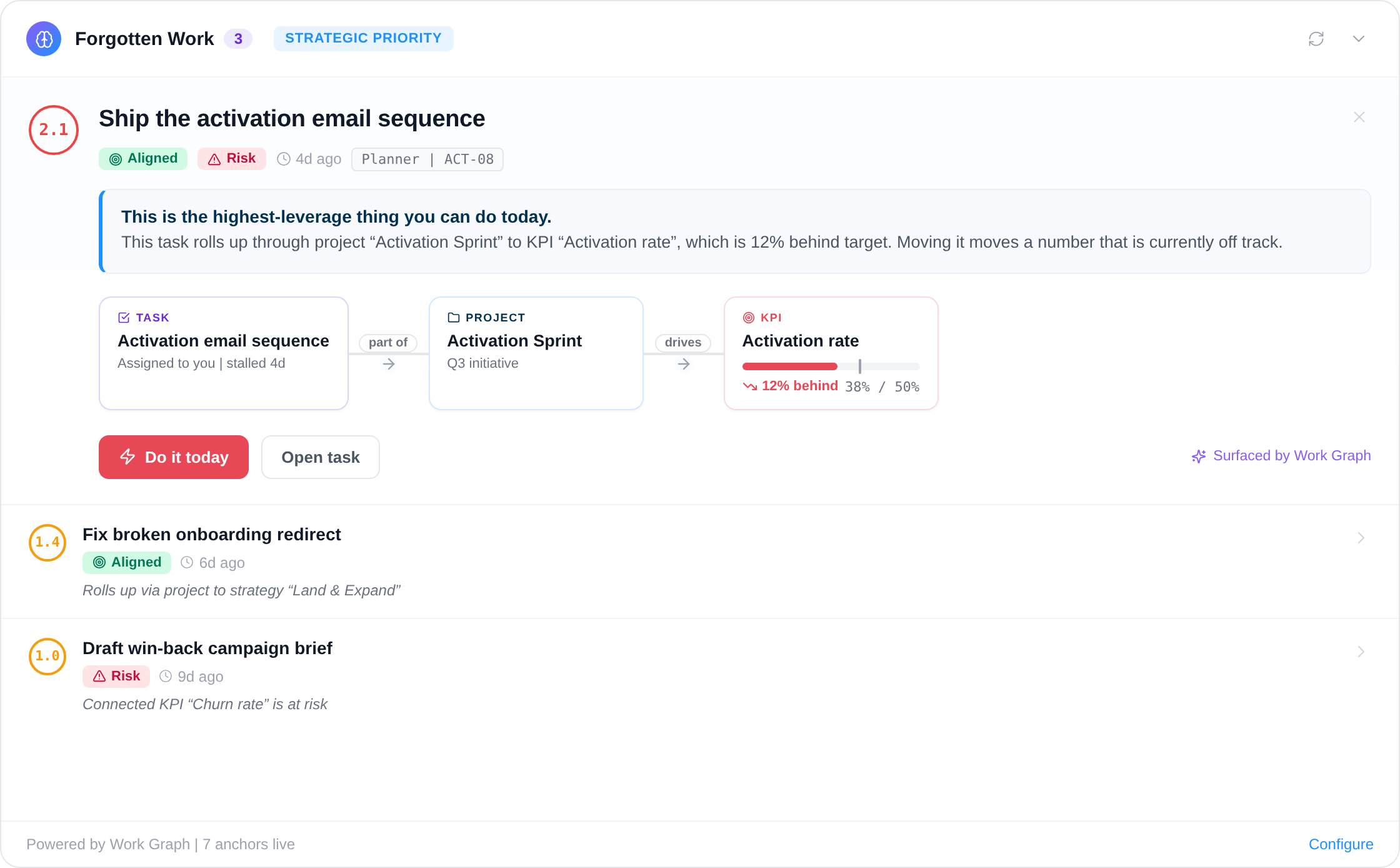
Deterministic and AI-driven alerts watch pace, focus and routine underneath every example view above.
Your framework, your language, your data in Europe.
Vindaris fits whichever goal syntax your teams already use, because the tracking problem is the same underneath and switching syntax should not mean switching tools.
Tracks goals in any framework
Vindaris ships without a prescribed methodology, so OKRs, KPIs, SMART goals and EOS Rocks are all tracked the same way in one workspace. Teams keep the format that suits them while leadership keeps a single connected view of progress.
Your data stays in Europe
Vindaris runs in a Hetzner data center in Nuremberg and was built around European data sovereignty from the start. Procurement and your DPO will find the answers they need in the trust center.
Free forever, including two integrations.
Free is a working tracker for a team of five, with two integrations and automatic progress. It is not a fourteen-day window, and there is no card to enter.
Best for individual contributors, small teams or startups. No credit card required.
- All views: Canvas, My Priorities, Heatmap, Data Studio and Task Board
- Two integrations of your choice
- Up to four additional members
- Five ad-hoc AI risk summaries per month
Best for teams, small agencies, or departmental and team management.
- Everything in Free
- All integrations, unlimited sync
- Unlimited AI risk summaries and alignment suggestions
- Up to ten users in one organization
Best for multiple teams, exec teams, Chiefs of Staff or full-org deployments.
- Everything in Connect
- Unlimited users in one organization
- Direct human support, 24h response
- Human-led onboarding
Spec the dashboard before you build anything.
Free files and browser tools that run without an account. Useful whether the dashboard ends up in Vindaris or somewhere else.
Common questions, answered
What should an executive dashboard show?
Three layers: the strategic KPIs scored against plan, the pace of each one (whether the trend reaches the target by the deadline), and the work behind any number that is off pace. A dashboard that shows only current values stays green until the miss; pace and traceability are what make it an early-warning system.
What is the difference between an executive dashboard and a BI dashboard?
A BI dashboard visualizes data from the warehouse and answers analytical questions. An executive dashboard answers one operating question: are we going to hit the goals, and if not, where do I act. It needs pace against plan and a connection to the underlying work, which BI tools do not model.
Which KPIs belong on a CEO dashboard?
The handful that define the year: revenue or growth against plan, the two or three strategic-bet KPIs, cash or runway, and one health signal per major function. Fewer than ten. Every KPI should have an owner and a target with a date, or it is decoration rather than a decision input.
How often should an executive dashboard update?
Continuously, from the source systems. A dashboard assembled weekly by hand is a report with a delay built in, and the delay is where surprises grow. When numbers derive from the connected work, the dashboard is always current and the weekly rhythm becomes about decisions, not assembly.
Who builds and owns the executive dashboard?
Usually the Chief of Staff or a COO owns the view, and the KPI owners own their numbers. The practical rule: the person who runs the operating cadence owns the dashboard, because the dashboard exists to serve the weekly and monthly reviews rather than to be an artifact of its own.
Copy an example. Keep the pace, the drill-down and the alerts.
Map the goals, connect your first tool in 90 seconds, and the dashboard fills itself. Free forever up to five people.
Build your executive dashboard freeNo credit card | No migration | No minimum contract